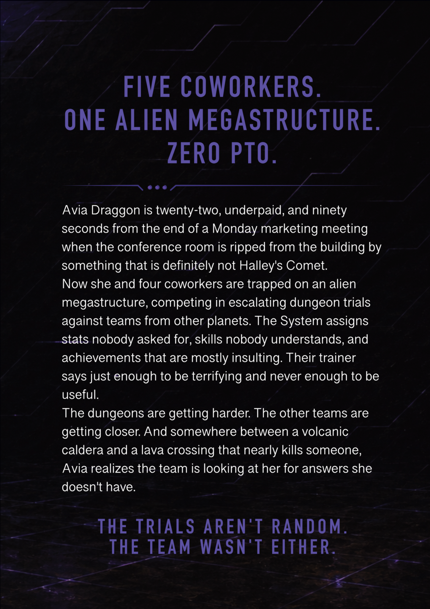
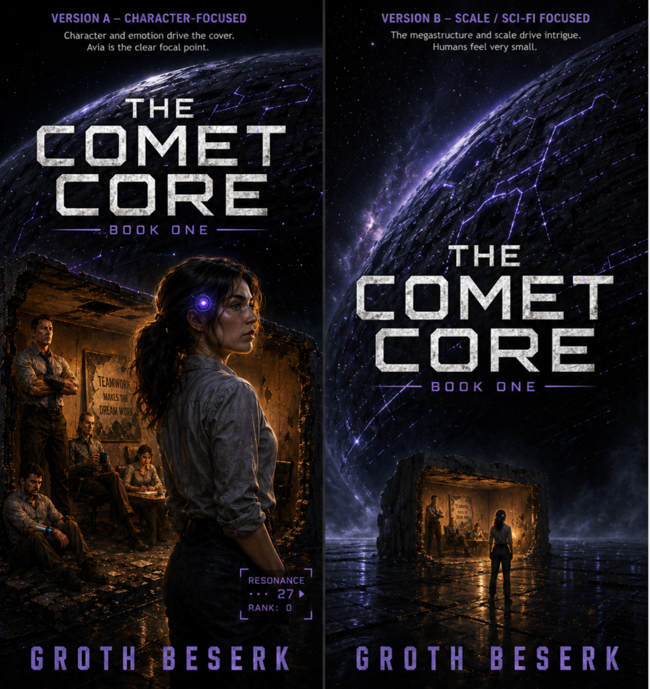

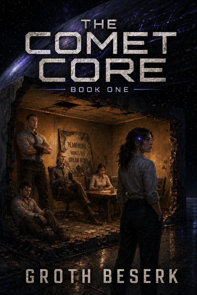
01
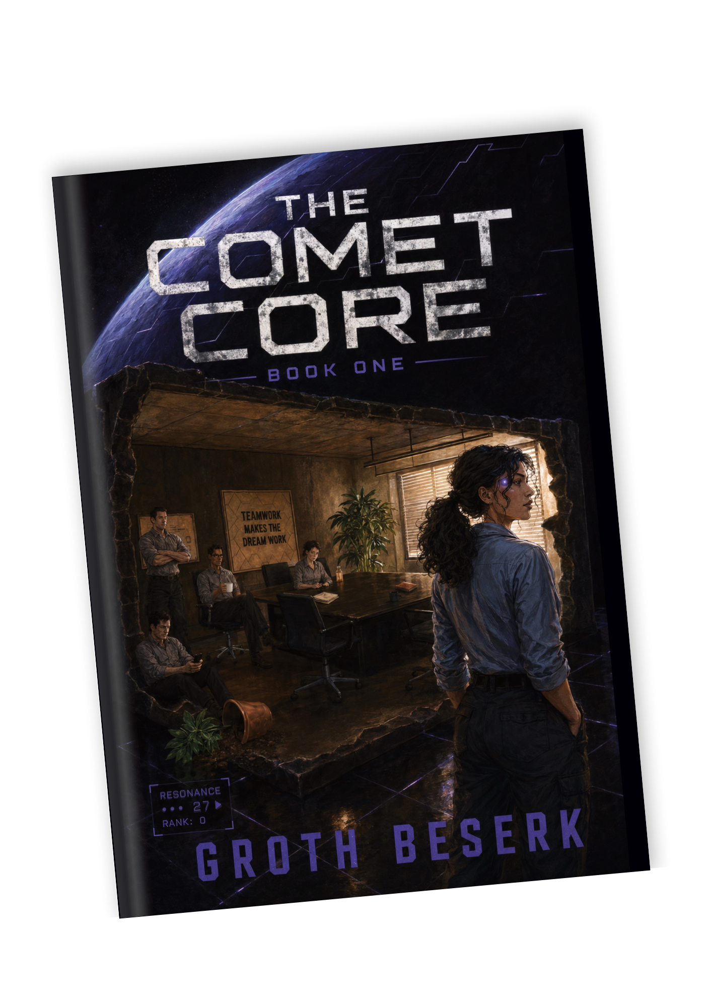
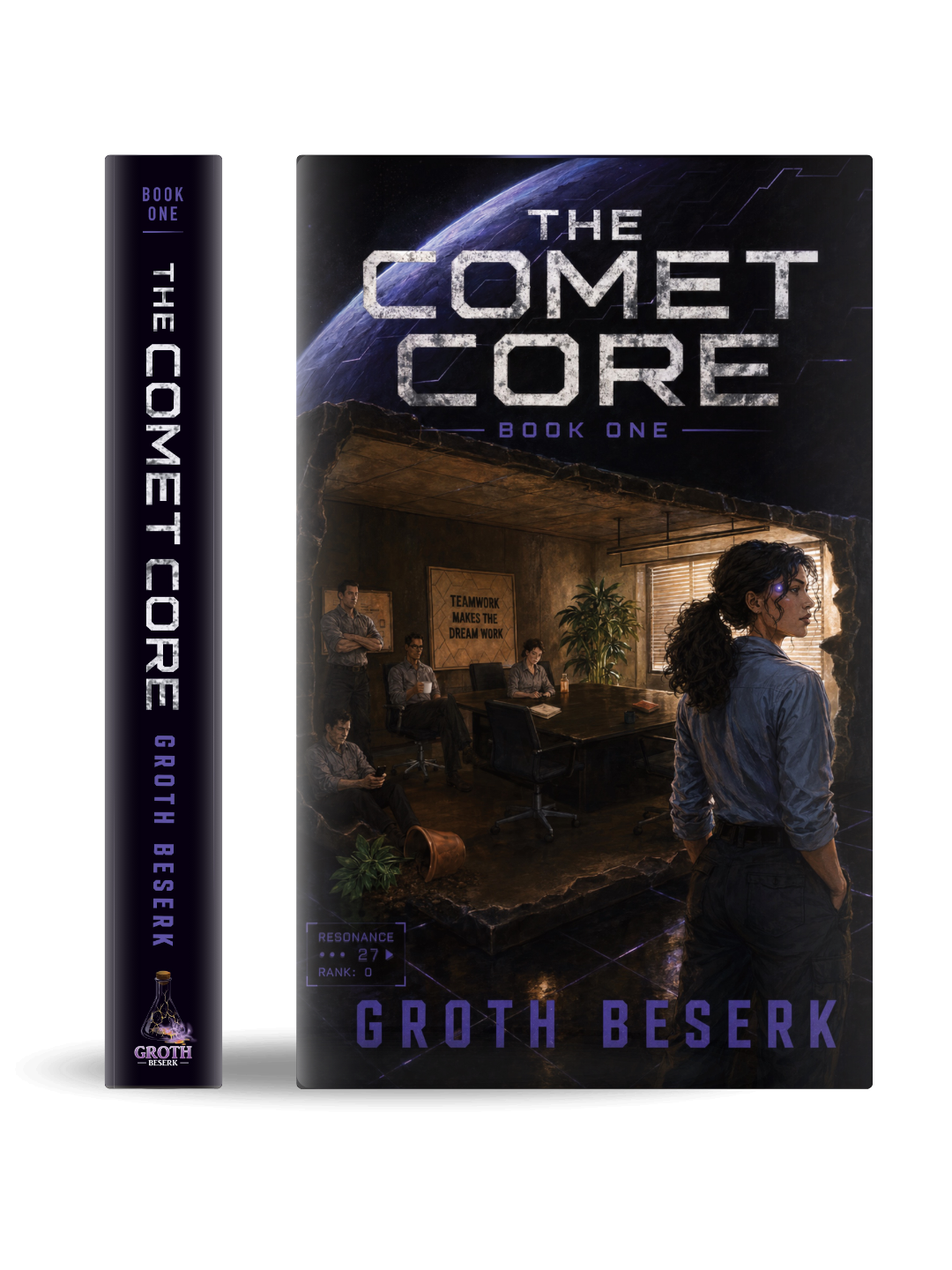
Starting from the author’s concept.
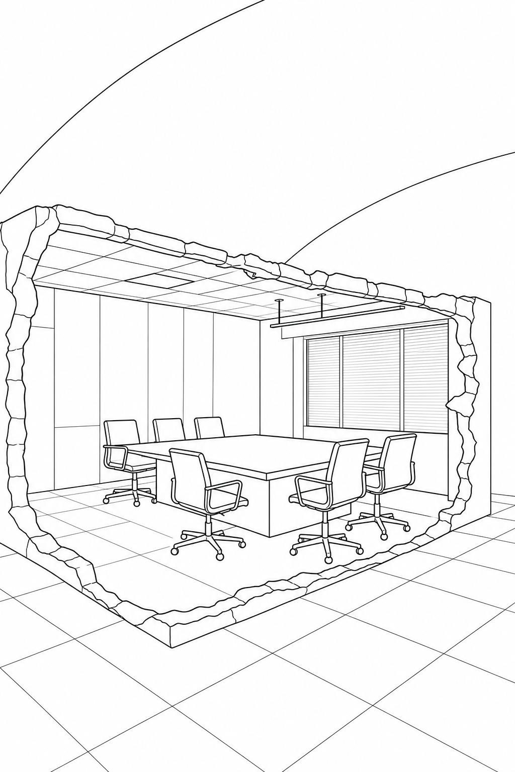
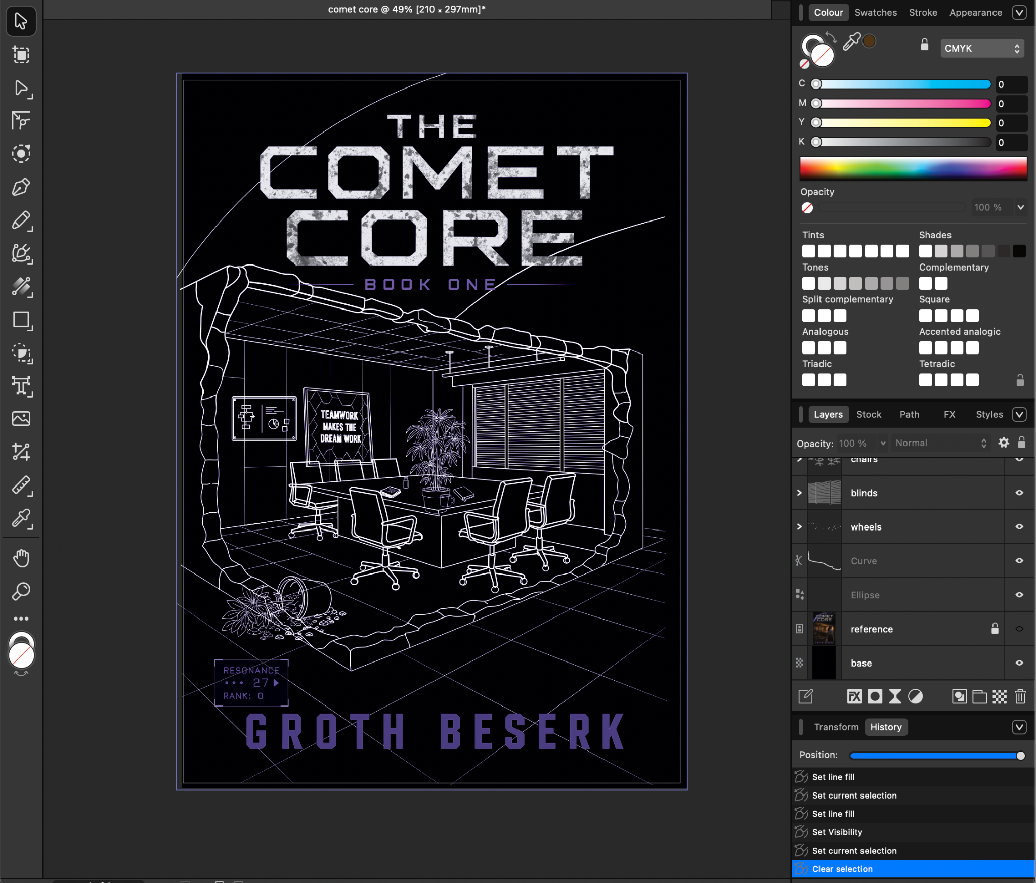
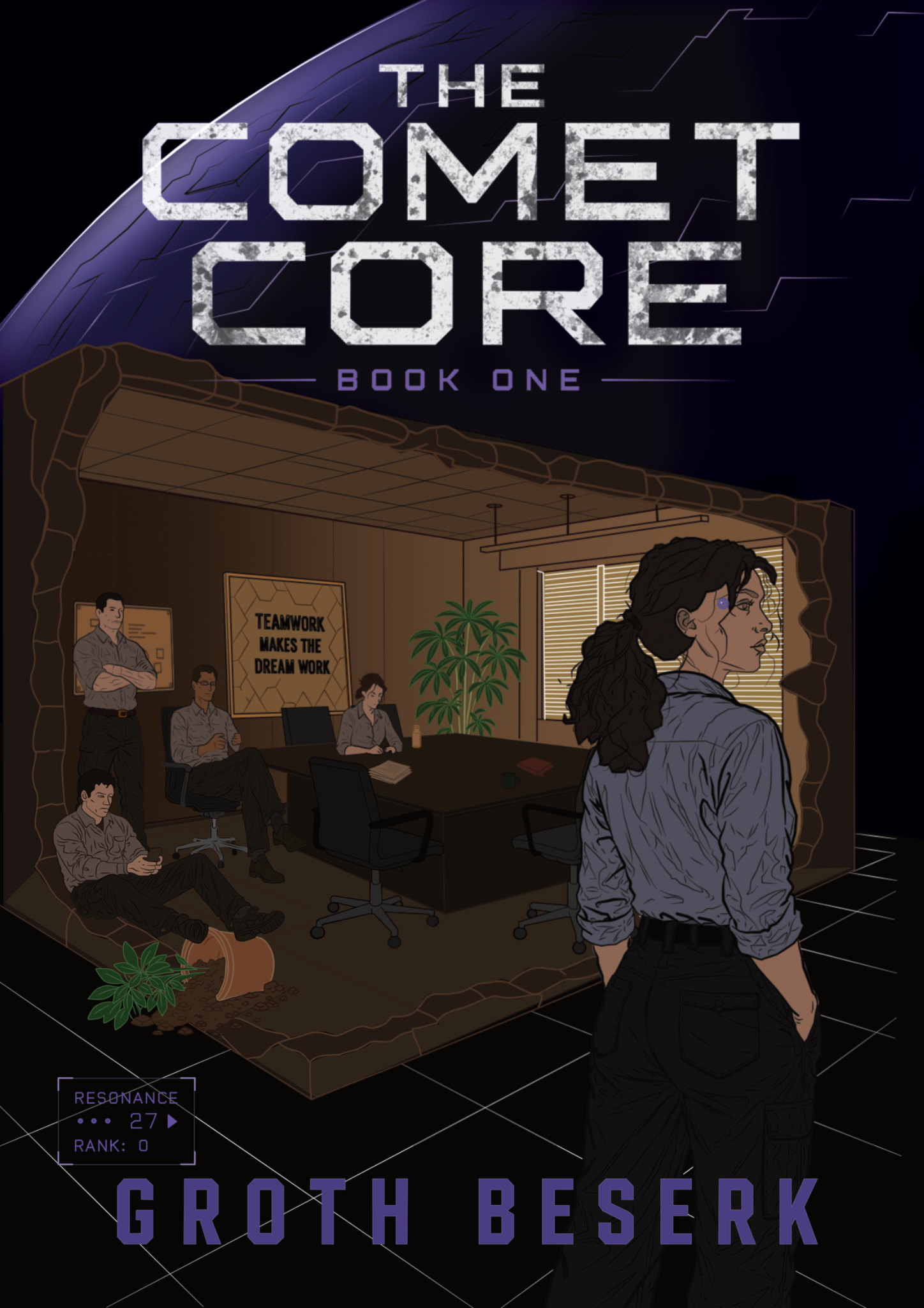
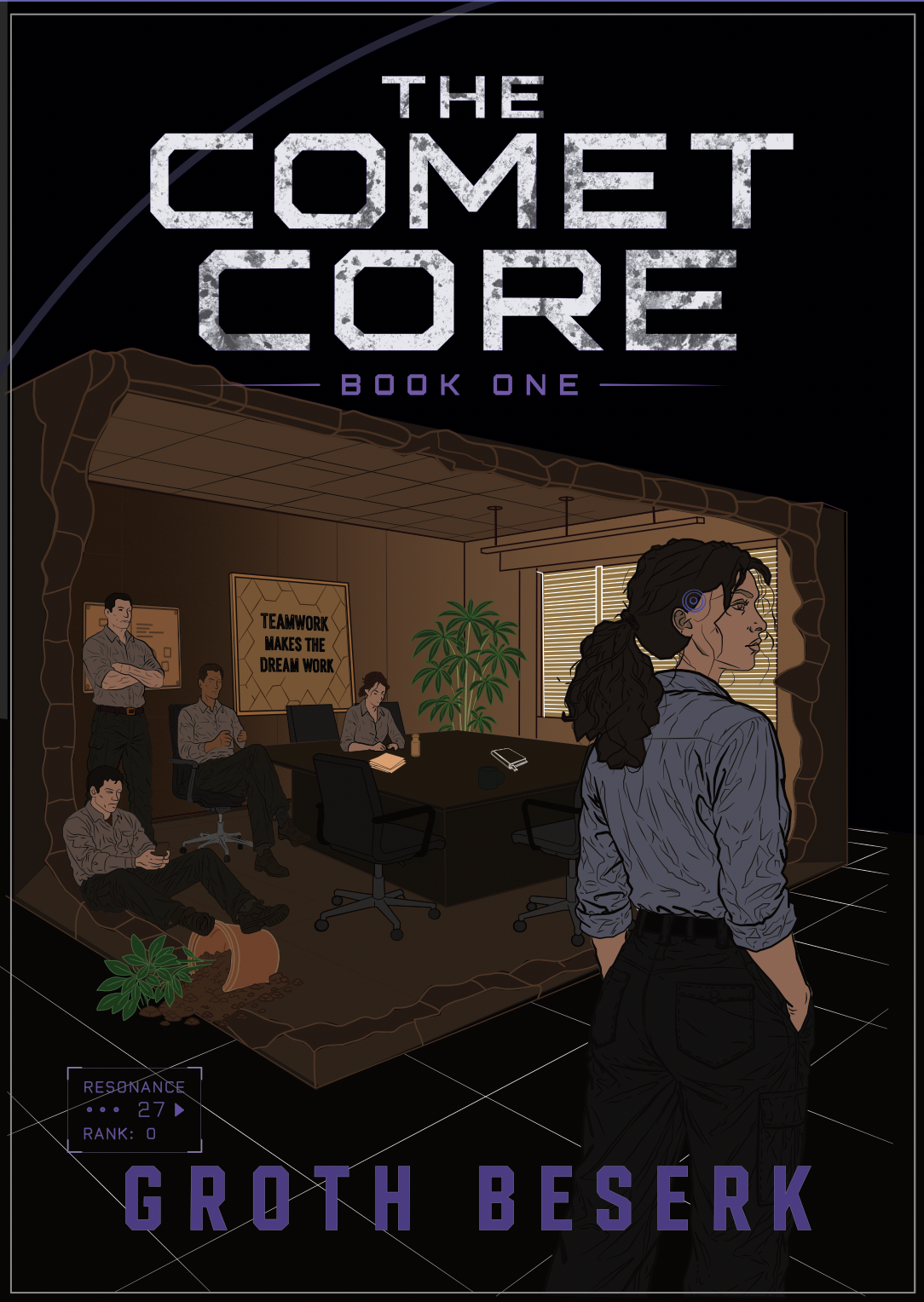
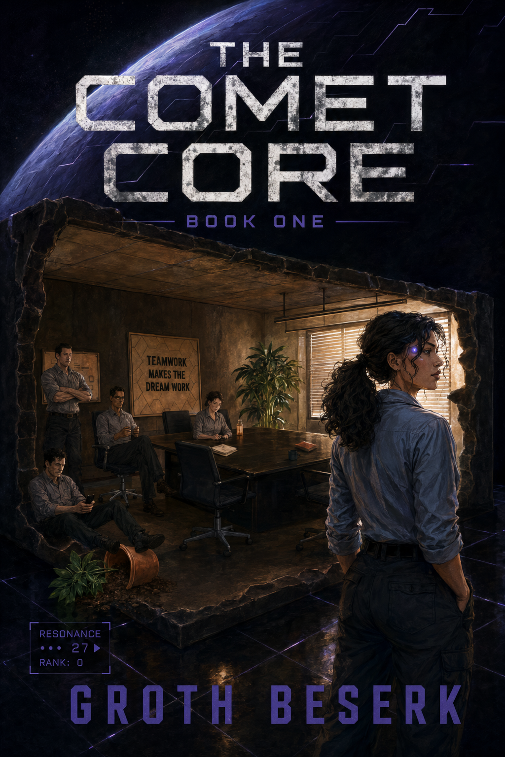
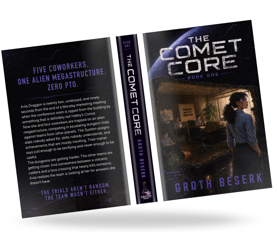
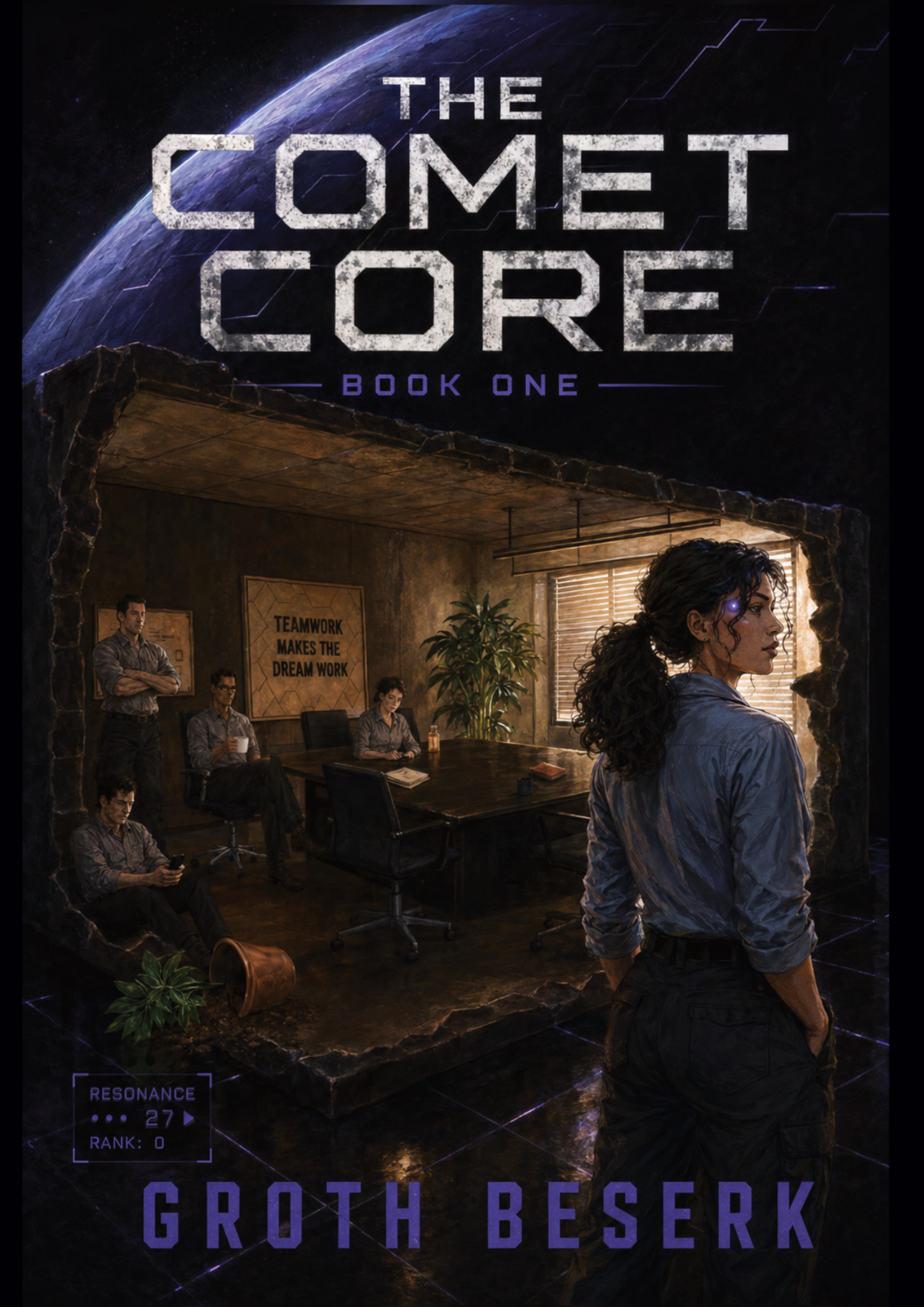
The client’s initial image already established the core premise: an office scene inside a torn-out room, a sci-fi grid environment, a massive structure and bold industrial typography.